I need your help.
Some people at our company think the current logo is perfect and modern, good looking, as it is.
But as you see – it's not. There's so much wrong with it. But the most annoying part with it is, that because of the small text, it always has to be placed pretty big.
Now I need your help: The internal argument is, that many people already praised our current logo and allegedly some experts think the current logo is great too. I don't know where they got these "experts" from, but if you could just give your opinion about the current Logo and the refreshed Logo … I, and the future of our company would be very grateful to you 😅😂
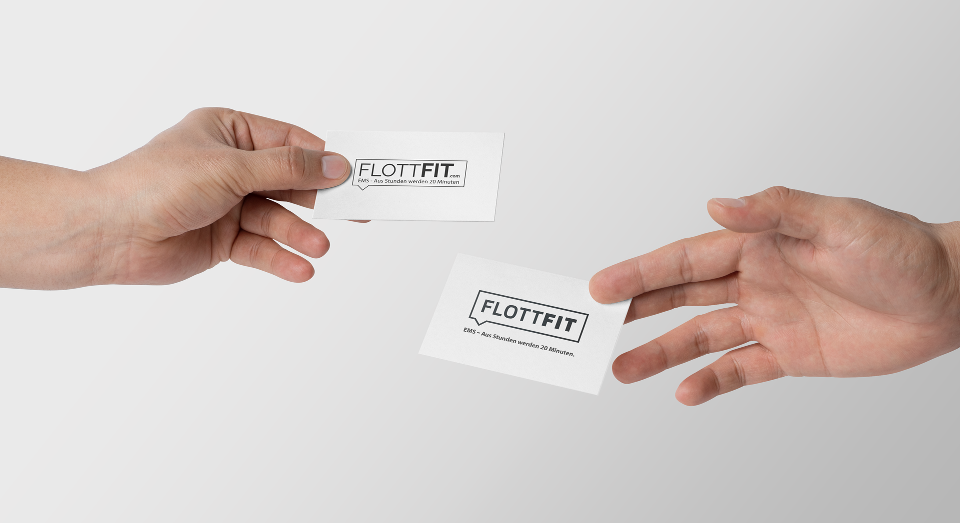
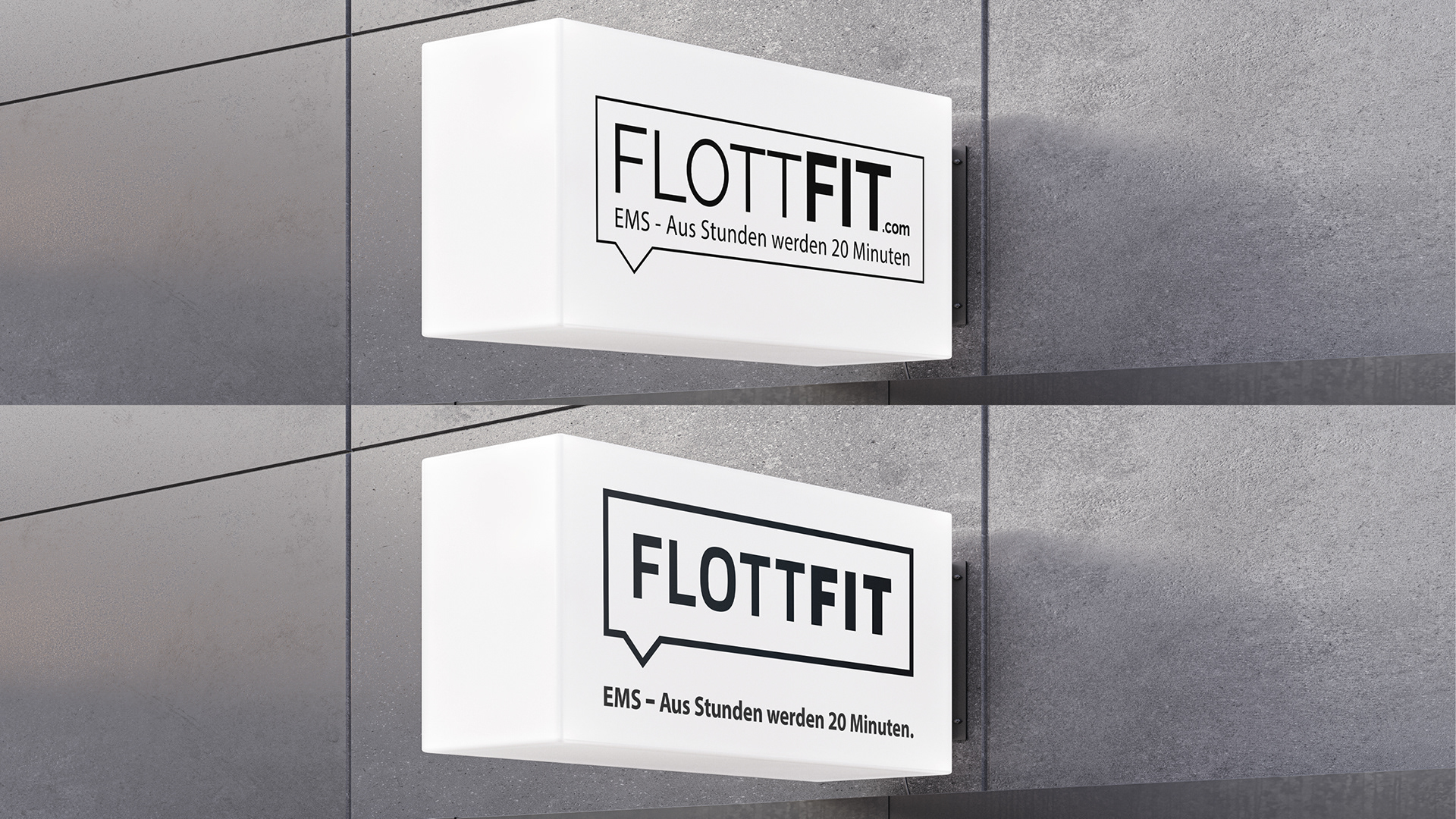
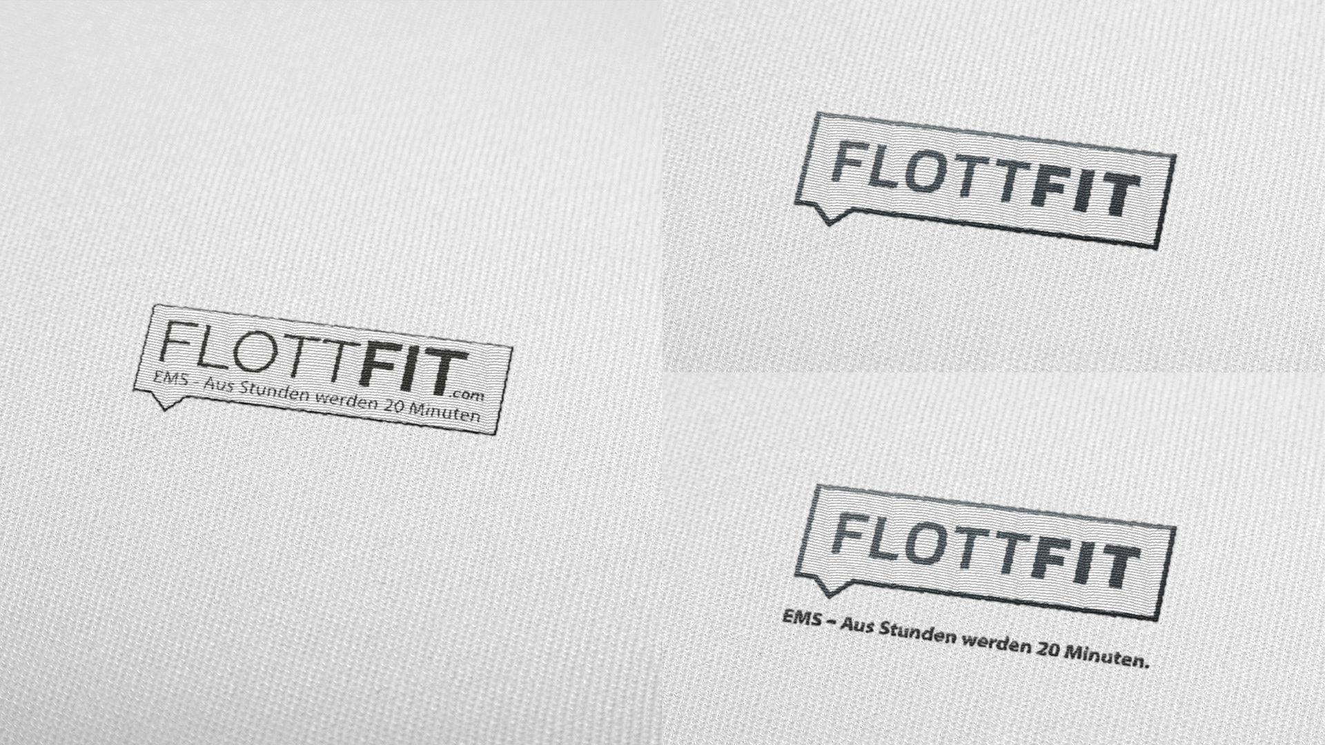
Current Logo:

Refreshed:
Yes, the claim is not included in the Logo but will / can be placed when necessary.
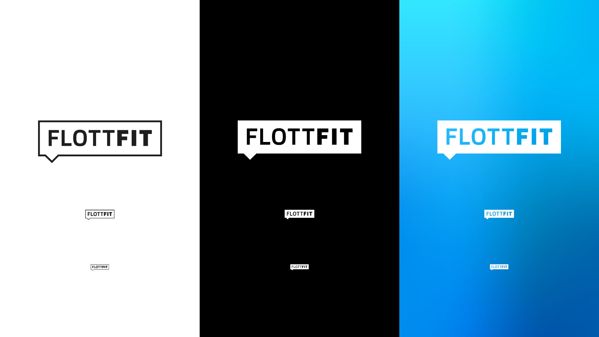
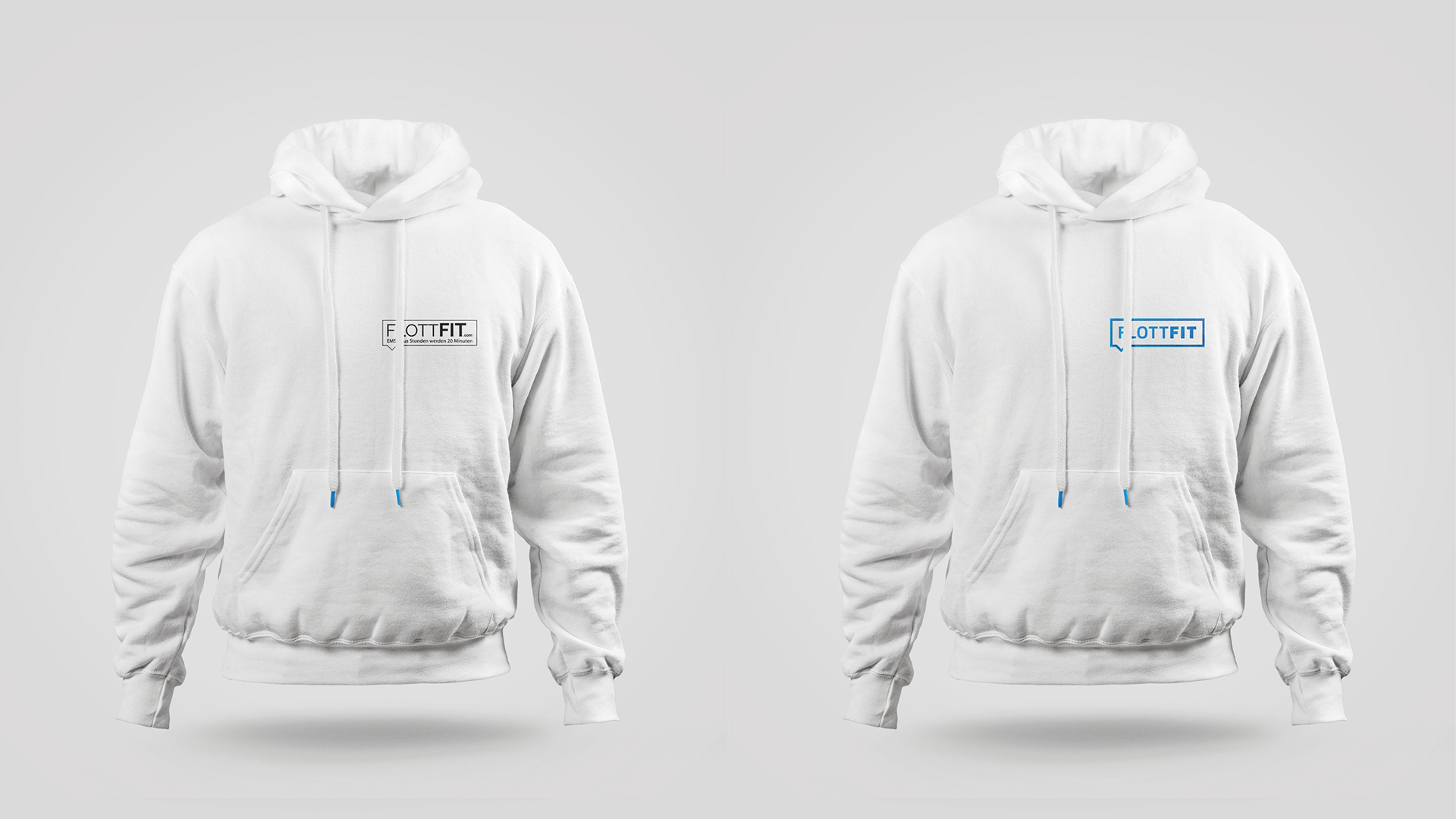
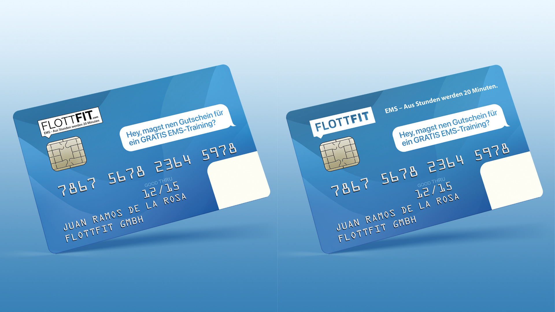
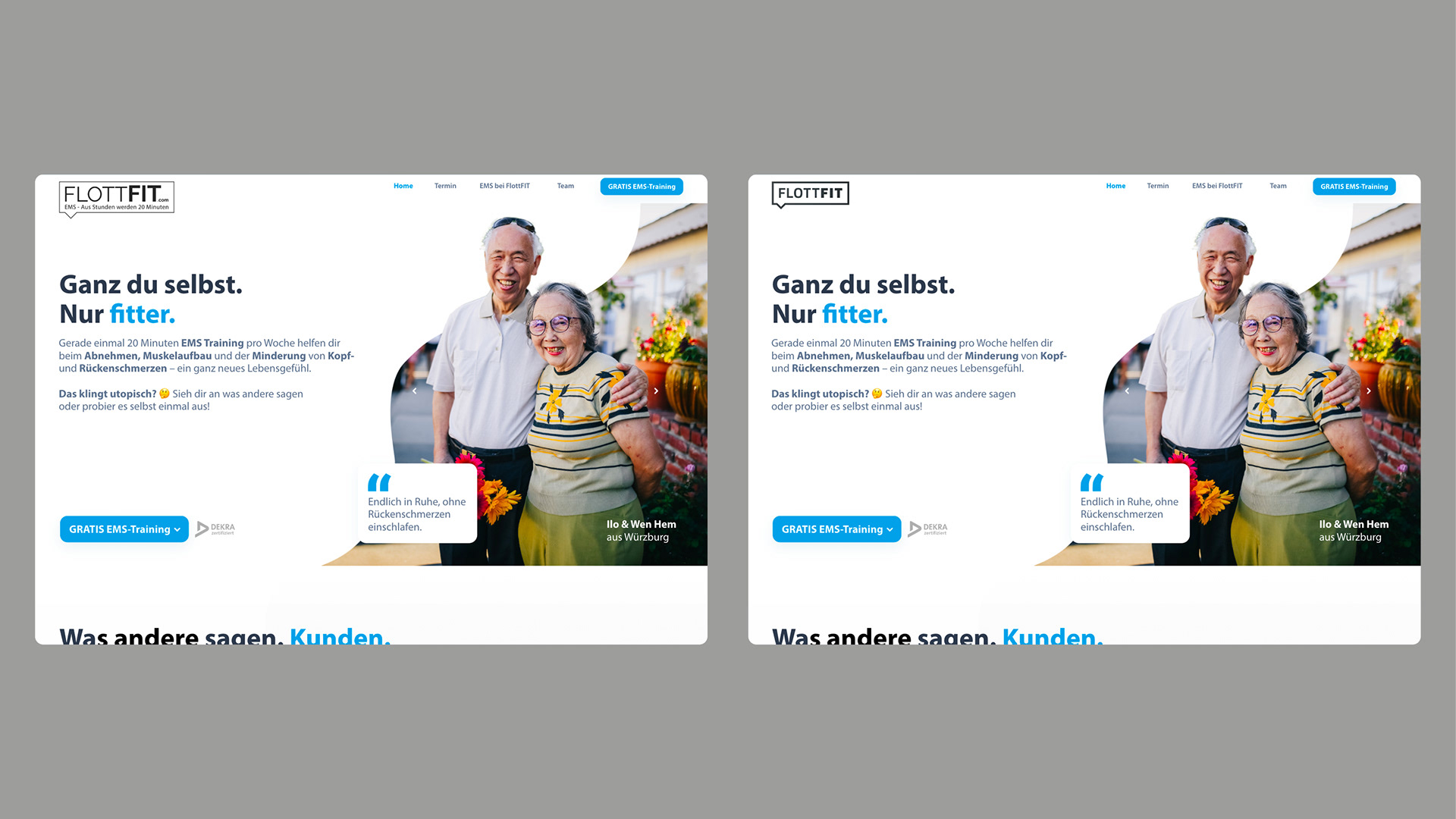
The main feature of the refresh was to maintain the recognition value but to achieve a more modern look.
Some more comparisons:
Colorssss! :)
The refreshed logo is not exactly perfect yet, and it's not 100% well thought out. But it is a start. Feel free to write us your opinion in the comments! Thanks a lot!